


 BESTSELLERS
 NEW ARRIVALS
 SALE
SALE


 Colors


 Materials


 Brands


 Themes


 BESTSELLERS
 NEW ARRIVALS


 BESTSELLERS
 NEW ARRIVALS
 DIRECTLY AVAILABLE
 SALE
SALE


 BESTSELLERS
 NEW ARRIVALS


 Little Greene verf
 Colours of England verfcollectie
 Colour Scales verfcollectie
 Sweet Treats verfcollectie
 RAL kleuren verf


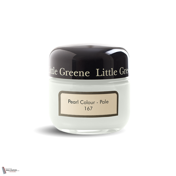


Little Greene Pearl Colour Pale 167 – A Light and Soothing Colour for Any Interior
Looking for a soft, light shade that will make spaces feel bright and inviting? Little Greene’s Pearl Colour Pale 167 paint is an elegant paint colour with an LRV (Light Reflectance Value) of 79, meaning it reflects a lot of light and creates an airy feel.
What makes Pearl Colour Pale 167 special?
This colour is a lighter version of Pearl Colour and has a subtle and neutral look. It is a versatile shade that fits perfectly in modern and classic interiors. Due to the high light reflection, Pearl Colour Pale makes rooms feel optically larger and fresher.
How do you combine Pearl Colour Pale 167?
- With warm earth tones for an inviting atmosphere.
- With deep blue tones such as Hicks' Blue 208 for a stylish contrast.
- With soft pastel colours for a serene and harmonious look.
This color works great in living rooms, bedrooms and kitchens, and can also be used on woodwork for a cohesive look.


