Inspiration
Pattern Drenching: the art of an interior full of pattern
Want to enhance the enveloping effect? Let the pattern continue from wall to ceiling. This blurs the boundaries and makes the space feel more unified. Even in smaller rooms, a large-scale pattern can work surprisingly well.
What is Pattern Drenching?
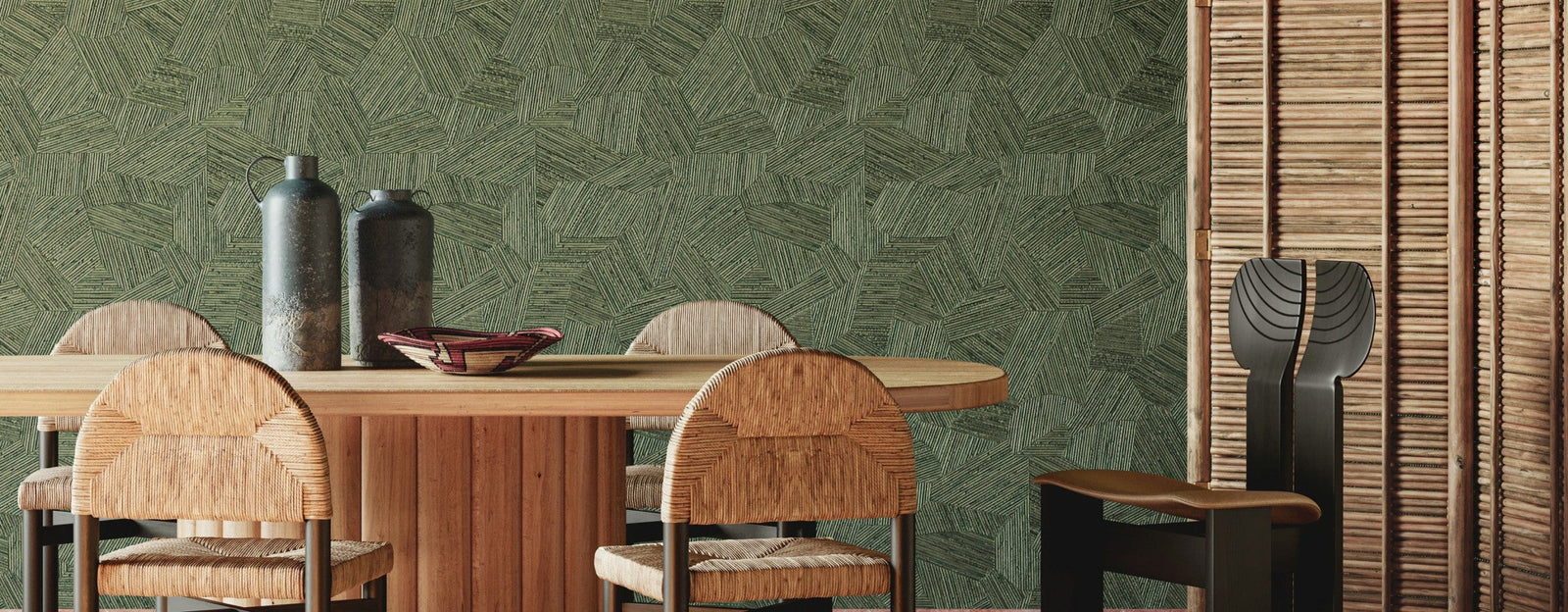
Pattern Drenching is a way of decorating where pattern isn't applied as a standalone accent, but encompasses a large part of the space. This can be quite literal: the same pattern on all walls and possibly the ceiling. But it can also be more layered, where different patterns are combined within one cohesive color and scale story — also known as pattern-on-pattern.
This makes Pattern Drenching fundamentally different from the familiar accent wall. With an accent wall, the pattern is contained. With Pattern Drenching, you let the pattern move through the space. The pattern is no longer a decorative accent, but part of the total experience of the interior.
Why are we seeing Pattern Drenching right now?
Pattern Drenching fits into a broader movement in interiors where personality, layering and decoration are gaining more space again. After years in which calm, minimalist interiors dominated the scene, we're seeing renewed interest in distinctive patterns, historical influences and spaces that clearly show who lives there.
This doesn't mean minimalism is disappearing. But there's more freedom in using pattern. Wallpaper no longer needs to be limited to one accent wall; a pattern can connect multiple walls, continue across the ceiling or form the starting point for other patterns in the space.
This development also has strong historical roots. Long before the term Pattern Drenching existed, interiors were already fully dressed with patterns. Think of richly decorated French interiors, English country houses and the layered rooms of designers like Sybil Colefax and John Fowler. Contemporary designers are once again embracing this idea: not one isolated decorative element, but an interior where walls, architecture and furnishings together tell one story.

This is precisely where Pattern Drenching differs from a trend that's only about a certain color or print. It's primarily a way of looking at the entire space. Where does the wallpaper stop? Should it even stop there? What happens when a ceiling, niche or slanted wall becomes part of the same pattern?
Pattern Drenching isn't about adding as much pattern as possible. It's about pattern no longer being treated as an accent, but as part of the architecture and identity of the space.
From cautious to complete: three ways to apply Pattern Drenching
Pattern Drenching doesn't have to mean immediately covering every wall, the ceiling and the furnishings of a space in pattern. The strength of the concept lies precisely in the freedom to determine how far you let the pattern run through the space. From one pattern connecting multiple walls to a fully layered interior: there are different ways to apply the trend.
1. One pattern on all walls
The most accessible form of Pattern Drenching is to apply the same wallpaper on all walls of a space. Instead of one accent wall, the pattern gets the opportunity to embrace the entire room.
Because the pattern doesn't stop abruptly at the corners, a much stronger spatial effect is created. Especially botanical patterns, classic ornaments and landscape patterns can almost work as a backdrop around the space.

This is a good way to get acquainted with Pattern Drenching without having to combine different patterns. Keep furniture and accessories more selective when the wallpaper is distinctive, so the pattern gets enough space.
2. Let the pattern continue to the ceiling
If you want to amplify the enveloping effect, the pattern doesn't have to stop at the top of the wall. By also wallpapering the ceiling, the traditional boundary between wall and ceiling blurs and the space is experienced much more as one whole.
This can work particularly beautifully in a hallway, toilet, bedroom, dressing room or room with slanted walls. Precisely niches, slanted ceilings and other architectural elements can become part of the design instead of an interruption of it.
A large pattern can work surprisingly well here. So it's not necessary to automatically choose a small pattern for a small space. Look especially at the composition of the pattern and what happens when the pattern surrounds you.

Selected tip: don't just view a wallpaper sample up close. Place it against the wall and step back several meters. With Pattern Drenching, not only the detail is important, but especially the rhythm and scale of the pattern in the complete space.
3. Build further with pattern-on-pattern
The most layered execution emerges when you also bring other patterns into the space alongside the dominant wallpaper. This is often called pattern-on-pattern.
The difference is important: Pattern Drenching is the overarching concept where pattern envelops the space; pattern-on-pattern is a way to add an extra layer by deliberately combining different patterns.

A large-scale botanical wallpaper can, for example, work together with a smaller stripe, check or geometric motif. That second pattern can return in an armchair, rug, headboard or textile. The goal isn't for everything to become the same, but for the different patterns to visibly be part of the same family.
Especially with this form, the balance between color, scale and hierarchy becomes important. Which pattern takes the lead? Which color connects the patterns? And are the patterns sufficiently different in scale so they don't compete with each other?
The three anchors of Pattern Drenching: color, scale and hierarchy
Pattern Drenching has no fixed formula. There's no official 70-20-10 division that determines how much pattern you can use. What successful interiors do have in common is that the patterns aren't randomly chosen. Color, scale and hierarchy provide the connection.
Don't see these three anchors as hard rules, but as a practical tool. The more patterns you add to a space, the more important it becomes that coherence emerges somewhere.
1. Color: Find the connection
Different patterns don't need to have the same colors, but a shared color makes it much easier to combine them. Therefore, look carefully at the color palette of your main wallpaper pattern. Often there are multiple shades that you can use as a starting point for the rest of the interior.
A botanical wallpaper with, for example, green, soft blue and cream can easily be combined with a stripe or geometric pattern in which only that green reappears. The patterns are different, but the repeated color ensures they belong together.
You don't need to literally repeat every color from the wallpaper. Rather choose a few shades that determine the atmosphere of the space.
Selected tip: use the wallpaper as a color palette. Take two or three shades from the pattern and let them return in different places in the space.
2. Scale: don't let patterns compete with each other
Besides color, the scale of the pattern is important. Especially with pattern-on-pattern, an interior can become restless when different patterns are roughly the same size and equally distinctive.
A large botanical pattern, for example, often combines more strongly with a fine stripe, small check or subtle geometric pattern than with a second large-scale floral print. By using different scale sizes, each pattern gets its own role.
Don't think in exact centimeters, but in the visual proportion:
large → medium → small
The largest pattern typically draws attention first. A medium-sized pattern can build on that, while a finer pattern adds detail and rhythm.
Even when you use only one wallpaper pattern, scale remains important. A large pattern makes a powerful statement and gives the pattern space to unfold as a larger composition. You see larger flowers, leaves or shapes less frequently, so the repetition can be experienced less emphatically. With Pattern Drenching, such a pattern can achieve an almost panoramic and enveloping effect.
A small, denser pattern creates more rhythm and continuity. Because the motif repeats more often, the individual shapes are less noticeable from a distance and mainly the rhythm of the pattern becomes visible. The wallpaper can therefore dress the space as a whole and give a more intimate, richer feeling.
Large isn't automatically busier and small isn't automatically calmer. Contrast, color use, density of the pattern and the distance between motifs determine at least as strongly how present a pattern is experienced.
3. Hierarchy: choose which pattern takes the lead
Perhaps the most important anchor: not every pattern needs to demand equal attention.
First determine which pattern takes the lead in the space. This could, for example, be the wallpaper you've chosen as the starting point for the interior. Other patterns can connect to it by repeating a color, adding a different scale or providing a subtle contrast.
With pattern-on-pattern, restlessness emerges when multiple distinctive patterns simultaneously demand attention. A large floral print, a striking check, a colorful rug and a graphic pattern can individually be beautiful, but together they quickly compete with each other.
Therefore, with every addition, look at the role the pattern gets. Is this the pattern that should stand out first, or does it support the pattern that already has the lead?
This doesn't mean the rest of the interior must remain neutral. Pattern Drenching can be rich, distinctive and layered. By choosing one pattern as a clear starting point, the other patterns get a logical place within the whole.
No formula, but coherence
There's no fixed proportion for a successful Pattern Drenching application. The three anchors work together: color provides connection, difference in scale prevents patterns from competing with each other, and hierarchy determines where attention goes first.
Therefore, don't see it as a formula you must follow exactly, but as three points to fall back on when you choose and combine patterns. This way an interior can be rich in pattern yet feel like one whole.
Does Pattern Drenching work in every interior?
Pattern Drenching isn't reserved for large, distinctive interiors. The technique can work just as well in a compact toilet, bedroom or hallway as in a spacious living room. The question is mainly how intensely you want to apply the pattern and which execution suits the space.
Architecture also plays a role here. Slanted walls, niches and ceilings don't need to form an interruption, but can precisely become part of the pattern. In other interiors, it can be more beautiful to deliberately leave certain architectural elements free or emphasize them with color.
A restrained interior can already change by applying one pattern all around. In a more distinctive interior, you can go further with a wallpapered ceiling or a layered pattern-on-pattern application.
So it's less about the question whether a space is suitable for Pattern Drenching, and more about which execution suits that space.
When does Pattern Drenching become too busy?
Pattern Drenching can be distinctive. In fact: an interior full of pattern loses part of its power when you try to tone it down too much out of caution. Yet there's a difference between rich and layered and a space where everything simultaneously demands attention.

An interior usually doesn't become too busy because of the amount of pattern alone, but because there's too little coherence or distinction between the different elements. Think of multiple distinctive patterns that all want the lead, colors that don't return anywhere, or furniture and accessories that demand just as much attention as the wallpaper.
Therefore, don't just look at each pattern separately, but at the overall picture. Where does your gaze go first? And where next? When everything simultaneously demands attention, it can help to choose a pattern more subtly, let a color return more often, or simply leave out an element.
Even when you apply one pattern on all walls and the ceiling, the rest of the furnishings play an important role. Resting points don't have to mean returning to white walls or exclusively solid-colored furniture. They can also emerge through material and form. Think of a calm wooden table, a simple lamp, a floor without distinctive pattern, or furniture with calm, simple shapes. These elements demand less attention and give the wallpaper more space to determine the atmosphere.
Selected tip: start with the wallpaper and then build up the interior layer by layer. Don't automatically add more because Pattern Drenching can be distinctive. This way you can much better assess when the space feels complete.
The most important question is therefore not: how much pattern is too much? There's no fixed limit for that. Rather look at whether the different choices strengthen each other and together tell the same interior story. A space can carry a surprising amount of pattern, as long as not every element simultaneously tries to play the lead.
Which patterns work for Pattern Drenching?
In principle, almost any pattern can be the starting point for Pattern Drenching. The effect just becomes very different when you choose an exuberant floral print versus a refined stripe or small geometric motif. So don't just look at what you find beautiful on a sample, but especially at what atmosphere you want to create with the pattern in the full space.
Botanical and floral patterns
Flowers, leaves, birds and other botanical motifs lend themselves particularly well to a bold application. When such a pattern envelops multiple walls, the interior gets a rich, decorative character. With larger designs, the image can become almost landscape-like: you don't just experience a repetition of motifs, but the walls become an experience that you're standing in the middle of.
This category suits both classic interiors and a more contemporary design. Precisely the combination with sleek furniture, natural stone or modern design can prevent a botanical pattern from feeling too traditional.
Toile, chinoiserie and narrative patterns
Patterns that incorporate landscapes, figures, birds or other scenes give Pattern Drenching a completely different character. Up close you keep discovering new details; from a distance the pattern forms a backdrop around the space.
This type of wallpaper comes into its own particularly beautifully in a bedroom, study, hallway or dining room, where you can look at the pattern longer and discover the details.

A mural or panoramic wallpaper can also be the starting point for Pattern Drenching. Because the wall image itself already forms a large composition, you can combine it with a smaller pattern in, for example, an armchair, sofa or rug. By clearly varying in scale and bringing back colors from the mural, the different patterns remain in balance with each other.
Geometric patterns
Pattern Drenching certainly doesn't have to be romantic or classic. A geometric pattern gives the trend a much more graphic and modern character.
Repetition plays an important role here. When a geometric pattern is applied across multiple walls, a clear rhythm is created that can visually bring the space together. Depending on color and form, the result can be surprising and energetic, but also sleek and refined.
Stripes
A stripe might not be the first pattern you think of with Pattern Drenching, but precisely because of that it can result in a surprising effect. Vertical stripes emphasize the height of a space, while a pattern that continues across different surfaces can further accentuate the architecture.
It becomes particularly interesting when the direction changes, for example when a stripe continues from the wall to a slanted ceiling. The pattern then visibly responds to the shape of the space.
Small, repeating motifs
If you find Pattern Drenching attractive but aren't looking for a large, bold pattern, you can start with a smaller repeating motif. Think of small flowers, dots, leaves, stars or fine geometric shapes.
From a distance, the individual details become less dominant and mainly a rhythmic overall image is created. This allows you to execute a room completely in pattern without one large motif constantly demanding attention.
Selected tip: when choosing wallpaper, always look at a larger image of the pattern and not just a small sample. A pattern that seems subtle at 20 × 20 centimeters can have a completely different appearance across four full walls.
Pattern Drenching versus Color Drenching: what's the difference?
Pattern Drenching and Color Drenching start from a similar idea: instead of one accent, a large part of the space is treated as a whole. With one technique, pattern is central, with the other it's color.
With Color Drenching, color is central. One color, or different nuances within the same color family, is carried through across multiple surfaces. Think of walls, ceiling, doors, baseboards and other woodwork. This blurs the usual boundaries between these elements and creates a strong color statement.
With Pattern Drenching, pattern takes on that role. The pattern isn't limited to one accent wall, but is applied to multiple walls and possibly the ceiling. If you go a step further, you can add different patterns in a layered pattern-on-pattern application.

What's interesting is that both techniques can also reinforce each other. The background color or a shade from the wallpaper can, for example, be carried through to doors, frames, baseboards or the ceiling. This creates a combination of pattern and color where the different surfaces clearly belong together.
Selected tip: for the color of woodwork or other painted surfaces, take a shade directly from the wallpaper. That doesn't always have to be the most striking color; precisely a background color or smaller accent color can create a beautiful connection.
In short: with Color Drenching, color envelops the space, with Pattern Drenching it's pattern that does this. And when both are consciously combined, color and pattern can together define the entire space.
Is Pattern Drenching a new trend?
The term Pattern Drenching is relatively new, but the principle behind it certainly isn't. Interiors in which one pattern extends across walls, furniture and textiles have a long decorative history. Vogue traces this way of decorating back to, among others, French interiors from the time of Louis XIV and Marie Antoinette. Also in later English and American interiors we see rooms where pattern goes much further than one decorated wall.
What is new is the renewed attention to this way of decorating. Pattern Drenching explicitly got its own name within the interior world from 2024 and 2025 onwards, as a follow-up to Color Drenching and as part of a broader return to more personal, more richly decorated interiors. Also in 2026, this need for personality, character and interiors that feel less perfect and more personal remains clearly visible in international trend reports.
It's precisely this historical foundation that makes Pattern Drenching interesting. You don't have to literally follow the trend to be inspired by it. A classic floral pattern all around can fit within the concept just as well as a graphic stripe in a modern interior. It's the way pattern becomes part of the entire space that's central, not one specific interior style.
That's why we see Pattern Drenching more as a rediscovered way of decorating than as a trend that disappears again after one season. The patterns, colors and combinations will change, but the idea of giving a space character and cohesion with pattern has already proven itself much longer throughout interior design history.
Pattern Drenching may have a new name, but the idea behind it is timeless: not limiting a pattern to one wall, but giving it the space to define the interior as a whole.
Pattern Drenching starts with the right pattern
Pattern Drenching shows how much influence wallpaper can have on the experience of an interior. Not as decoration for one wall, but as a pattern that connects multiple surfaces and thus defines the atmosphere of the entire space.
How far you go with this is personal. Maybe one pattern on all walls suits your interior, maybe you let the wallpaper continue onto the ceiling. And if you're looking for more layering, you can build further with other patterns in a pattern-on-pattern application. There's no fixed formula for the right result.
The most important choice you therefore make at the beginning: which pattern do you want to give the leading role? Don't just look at color or a detail on a sample, but also at the scale of the pattern, the repetition and how the design will behave across a larger surface. Wallpaper that seems understated on a small sample can have a completely different appearance around a space — and vice versa.
So take the time to view a pattern in the context of your interior. Consider the dimensions of the space, the light, the architecture and the furniture that will remain. This way Pattern Drenching doesn't become a trend that you simply follow, but a way to create an interior that really suits the space and suits you.
Selected tip: are you hesitating between different patterns or want to know how a pattern will work out on multiple walls or the ceiling? We're happy to think along with you. Contact us for personal wallpaper advice in our studio or digitally.