BESTSELLERS
 NEW ARRIVALS
 SALE
SALE


 Colors


 Materials


 Brands


 Themes


 BESTSELLERS
 NEW ARRIVALS


 BESTSELLERS
 NEW ARRIVALS
 DIRECTLY AVAILABLE
 SALE
SALE


 BESTSELLERS
 NEW ARRIVALS


 Little Greene verf
 Colours of England verfcollectie
 Colour Scales verfcollectie
 Sweet Treats verfcollectie
 RAL kleuren verf


Inspiratie
Little Greene paint and wallpaper: everything you need to know before you buy
Considering Little Greene Paint & Paper for your interior? In this guide, you'll read what you need to know before purchasing about the different paint qualities, wallpaper collections, colours, finishes, samples and delivery times.
Which paint quality suits a living room, kitchen, or bathroom? What's the difference between Absolute Matt and Intelligent Matt? How do you combine Little Greene paint with wallpaper, and where can you order the products in the Netherlands?
We'll explain how to choose the right color and finish, what to look for in wallpaper, and how to bring together paint, patterns, and materials to create a calm and cohesive interior. You'll also learn how ordering color and wallpaper samples works, how much product you need, and where to find expert advice.
Selected Tip: Don't start with a single color. Place a wallpaper sample, multiple paint samples, and existing materials side by side, and evaluate the whole in the room itself.
Where the Little Greene story began
Long before paint was chosen from a digital color overview, a story began in the English county of Lancashire that's still visible in Little Greene's collections today.
It's 1773. Colors are mixed by hand, craftsmanship is passed down from generation to generation, and in one of England's first paint factories, the foundation is laid for what will later become Little Greene Paint & Paper. More than 250 years later, the paint and wallpaper collections are still developed in Great Britain, with the same attention to color, material, and detail.
This history isn't limited to a date on the packaging. In collaboration with the National Trust, Little Greene researches historic colors and original wallpaper fragments from British country houses, castles, and monumental interiors. These aren't simply copied, but reinterpreted for the way we live today.
This creates a collection where the past remains tangible, without the interior having to feel historic. A color or pattern tells an old story, but only gains meaning in the space where it's applied today.

What makes Little Greene Paint & Paper special?
Little Greene doesn't just look at an individual color or a single pattern, but at the coherence between all surfaces in an interior. Paint and wallpaper are developed within one color world, making it easier to coordinate walls, ceilings, woodwork, and patterns.
The paint stands out for its rich pigmentation. This gives colors more depth and makes them respond subtly to changing daylight. A shade can appear soft and subdued in the morning and become warmer or more intense later in the day. The different paint qualities are also developed for specific applications, from ultra-matte wall paint to durable lacquer for woodwork.
The wallpaper collections align with the same color palette. Historic patterns are recolored for contemporary interiors and can therefore be combined with paint colors from the same color family. This means the wallpaper doesn't have to be treated as a standalone accent, but can become part of a complete color scheme.
In addition, many paint qualities are water-based and developed for indoor use. Which quality is suitable depends on the surface, the space, and the extent to which the surface needs to be cleanable.
For us, the strength of Little Greene lies primarily in its applicability. You're not just choosing a beautiful color or print, but building an interior step by step where paint, wallpaper, materials, and light support each other.
Selected Tip: When choosing paint, don't just look at the color. The sheen level and washability determine just as strongly how the paint is experienced in daily use.
Which Little Greene products can you order at Selected Wallpapers?
At Selected Wallpapers, you'll find both paint and wallpaper from Little Greene Paint & Paper. This allows you to create a complete interior palette from one color story for walls, ceilings, woodwork, furniture, and wall coverings.
Within the paint collection, various wall paints, lacquers, floor finishes, and primers are available. Which quality you choose depends on the space, the surface, and the desired sheen level. For evaluating colors, color cards and sample pots are available.
The wallpaper collection consists of botanical, floral, graphic, and historic patterns. Many patterns are available in multiple colorways, so they can be combined with paint colors from the same color family.
Little Greene paint
Within the paint collection, you'll find:
- ultra-matte wall paint for calm living spaces;
- washable wall paint for intensively used spaces;
- lacquers for doors, frames, baseboards, and furniture;
- paint for floors and stairs;
- primers and undercoats for different surfaces;
- sample pots to test a color at home.
Little Greene wallpaper
The wallpaper collection consists of:
- botanical and floral patterns;
- small, refined designs;
- geometric and graphic prints;
- historic designs from British archives;
- collections developed in collaboration with the National Trust;
- patterns in various matching colorways.
Because roll size, pattern repeat, and match can vary per design, it's important to always check the product specifications before ordering.
Selected Tip: Preferably order paint and wallpaper samples at the same time. This way you can immediately assess how color, pattern, scale, and material relate to each other.
How do you determine the right balance between paint and wallpaper?
A harmonious interior isn't created by simply wallpapering one wall and painting the remaining walls white. The right balance between paint and wallpaper depends on the space, the light, the architecture, and the atmosphere you want to create.
Paint forms the connecting foundation, while wallpaper adds pattern, texture, and character. By consciously combining both, you create an interior that not only looks attractive, but also feels like a complete whole.

First look at the room as a whole
Don't immediately decide which wall you want to wallpaper, but first look at the entire space. Where does daylight come in? Which wall do you see first when you enter? Are there architectural elements, such as a niche, fireplace, custom cabinet, or high ceiling, that you want to emphasize?
The most suitable place for wallpaper isn't automatically the wall behind the sofa or bed. Sometimes a pattern works better on two adjoining walls, in a niche, or on the ceiling. By aligning the wallpaper with the architecture, it feels less like a separate decorative element and more like part of the interior design.
The scale of the pattern also plays an important role. A large design needs sufficient surface area to become visible, while a small pattern over multiple walls can actually give a calm, almost textile appearance.
Use paint as a connecting foundation
Once you've determined where the wallpaper will go, choose the paint colors for the remaining surfaces. Don't see paint just as a background, but as a full part of the color scheme.
A color from the wallpaper can, for example, reappear on the other walls, the woodwork, doors, or a custom cabinet. You don't have to repeat this color exactly. A lighter, darker, or more grayed shade from the same palette often creates more depth and a more natural result.
By also including the ceiling, baseboards, and frames in the color scheme, you prevent the space from consisting of separate sections. These surfaces in particular can visually connect paint and wallpaper.
Consider light and space
Light has a major influence on both paint colors and wallpaper patterns. A dark pattern can look rich and atmospheric in a bright room, but appear heavier in a space with little daylight. A light paint color can bring calm, while a deeper shade gives a large or high space more warmth.
Therefore, always view paint and wallpaper samples in the room itself. Evaluate them at different times of the day and place them next to the floor, curtains, furniture, and other materials. This way you'll see not only whether the colors are individually beautiful, but especially whether they work together within the interior.
Adjust the ratio to the desired atmosphere
There's no fixed ratio between paint and wallpaper. In a calm living room, one wallpapered wall may be sufficient, while a bedroom becomes more intimate when the pattern continues across multiple walls. In a compact space, such as a toilet or hallway, wallpaper can often be applied more boldly.
If you primarily want calm, choose paint colors that are close to the background color of the wallpaper. If you want more contrast, use an accent color from the pattern on woodwork, doors, or custom elements.
The most beautiful combinations arise when paint and wallpaper don't compete for attention, but support each other. Wallpaper gives the space identity; paint brings balance and cohesion.
Selected Tip: Hesitating between paint or wallpaper? Don't think in either-or, but in both-and. It's precisely the combination of both that creates an interior where color, texture, and material reinforce each other, making every space feel like one harmonious whole.
Selected Color Matches
The right combination of paint and wallpaper starts with the colors already present in the pattern. For our Selected Color Matches, we combine two Little Greene wallpaper patterns with four paint colors that support the palette.
The combinations consist of a calm base color, connecting support colors, and an accent color. Use them as inspiration for walls, ceilings, woodwork, custom elements, and accessories.
01 — Soft Botanicals

02 — Romantic Heritage

03 — English Elegance

04 — Botanical Retreat

Selected Tip: Don't just use the combinations on the walls. Let one or more colors reappear in woodwork, custom elements, upholstery, or accessories. By repeating colors in different places, you create more calm and cohesion.
How do you choose the right Little Greene color?
Choosing a color seems simple, until you open a color card. Suddenly there appear to be different shades of white, greige, green, blue, and pink. The best choice therefore isn't automatically the color that looks most beautiful on its own, but the shade that suits the space you live in.
When choosing a Little Greene color, we don't just look at the wall. The light, the size of the space, the existing materials, and the desired feeling all play an important role.
First look at the daylight
Light changes color. A warm greige can appear cooler in a north-facing room, while the same color in a space with southern light becomes warmer and softer.
Therefore, don't choose a color solely based on a photo or screen. Order a sample pot and view the shade at different times of the day. Morning light, afternoon sun, and artificial light can make a color look different each time.
Test the color on a large surface
A small color patch gives only a limited impression. Apply the paint to a large piece of cardboard or a loose test board, so you can move the surface around the room.
By not painting directly on multiple walls, you can easily view it next to the floor, curtains, furniture, and any wallpaper. This way you'll see how the shade reacts to different lighting conditions and materials.
Start with the largest surfaces
A cohesive interior usually starts with the largest surfaces. First choose a base color for the walls, then determine the colors for ceilings, woodwork, doors, and custom elements.
From this foundation, you can add supporting shades that reappear in upholstery, art, accessories, or wallpaper. This creates a color palette where each shade has a clear function.
Let materials help determine
A color never stands alone. Wooden floors, natural stone, curtains, upholstery, and metal accents all influence how a paint color is perceived.
A warm oak floor often calls for a different palette than a cool poured floor or natural stone floor. Therefore, always view the color next to the materials already present in the space.
Think in a color palette
The most beautiful interiors rarely consist of one color. Work from a calm base color and add several supporting shades for woodwork, textiles, or custom elements. An accent color can then add extra character to smaller surfaces.
Selected Tip: Hesitating between two colors? First order sample pots and view the shades over several days. Also place the wallpaper, floor, and fabrics next to them. It's precisely in that combination that you discover which color truly comes into its own.
What paint quality do you need?
A color determines the atmosphere of a space, but the paint quality determines how the surface behaves in daily use. That's why Little Greene offers different wall paints, finishes, floor coatings and primers for various applications.
When choosing a paint quality, consider:
- the surface;
- the room where the paint will be applied;
- the desired sheen level;
- the degree of wear;
- the desired washability;
- interior or exterior use.

Absolute Matt Emulsion
Ultra-matte wall paint for calm spaces
Absolute Matt Emulsion has a chalky finish with only 1–2% sheen. The paint is suitable for walls and ceilings in living rooms, bedrooms and dining rooms, among others.
Characteristic: a very matte, powdery appearance with great color depth.
Intelligent Matt Emulsion
Matte and washable wall paint for daily use
Intelligent Matt Emulsion combines an almost matte finish of approximately 2% sheen with a strong and washable paint layer. The paint is suitable for interior walls and ceilings in kitchens, bathrooms, children's rooms and hallways, among others.
Characteristic: a matte appearance with extra durability and washability.
Intelligent Eggshell
Hard-wearing paint for woodwork and humid spaces
Intelligent Eggshell has a subtle eggshell sheen of 10–15%. The paint is suitable for woodwork, metal and surfaces that need to be cleaned regularly, such as doors, frames, baseboards, radiators, kitchens and bathrooms.
Characteristic: a strong and low-maintenance finish for heavily used surfaces.
Intelligent Floor Paint
Durable paint for floors and stairs
Intelligent Floor Paint has a light satin sheen of approximately 30–40%. The paint is suitable for wooden and concrete interior floors, stairs and primed metal surfaces.
Characteristic: a hard-wearing, washable floor finish that withstands daily use.
Intelligent Satin
Refined satin sheen for woodwork and furniture
Intelligent Satin has a sheen level of 30–35%. The paint is suitable for doors, frames, baseboards, kitchen cabinets and furniture, among others.
Characteristic: a durable satin sheen that is practical in use and looks softer than high-gloss paint.
Intelligent Gloss
High gloss for a distinctive finish
Intelligent Gloss has a sheen level of 87–90%. The paint is suitable for wood and metal, both interior and exterior, and is often applied to front doors, frames, baseboards and other eye-catching details.
Characteristic: a reflective high gloss that gives colors extra intensity and depth.
Primers and undercoats
Good preparation ensures better adhesion and an even final finish. Which primer is needed depends on the surface and the chosen paint quality.
Intelligent ASP
Primer for various surfaces
Intelligent ASP is a water-based primer and undercoat for wood, metal, glass, ceramic tiles, PVC-U and laminated surfaces, among others. The primer can be applied both interior and exterior.
Characteristic: one versatile primer for various smooth and difficult-to-adhere surfaces.
Wall Primer Sealer
Primer for untreated and porous walls
Wall Primer Sealer is designed for new plasterwork, rendering and other untreated or highly porous walls and ceilings.
Characteristic: stabilizes the surface, regulates absorption and helps prevent a patchy final finish.
Selected Tip: Not sure about the right primer? Always check the material and condition of the surface. Proper preparation prevents adhesion problems and color differences in the topcoat.
Beyond paint: which Little Greene wallpaper suits your interior?
After choosing a paint color and paint quality, you can determine where wallpaper adds something to your interior. Not every room calls for a bold pattern and not every pattern needs to be limited to one accent wall.
The right choice depends on the scale of the pattern, the light conditions, the dimensions of the room and the colors already present.

Botanical and floral designs
Botanical patterns bring movement and natural layering to your interior. Small floral patterns can be applied across multiple walls, while larger leaves and flowers need more space to fully come into their own.
These designs don't just suit living rooms and bedrooms. A hallway, study, toilet or dining room can also gain more character from a botanical pattern.
Historical patterns
Part of the Little Greene wallpaper collection is based on original patterns from historical interiors and archives. The designs are recolored and adapted for contemporary homes.
By combining a historical design with calm paint colors and modern furniture, you create an interior that feels layered and personal, without needing to be classical or old-fashioned.
Graphic and small patterns
Small geometric or repeating patterns give a wall an almost textile-like appearance. They're suitable for spaces where you want to add detail, but don't want a large or dominant image.
A regular design can also beautifully continue across multiple walls, creating an enveloping effect.
Pay attention to scale and pattern repeat
The scale of a design is at least as important as the color. A small online product image doesn't always show how large a flower, leaf or shape is at actual size.
- Therefore always check:
- the width and length of the roll;
- the vertical pattern repeat;
- how the drops match;
- the dimensions of the wall;
- the amount of cutting waste;
- the position of windows, doors and furniture.
Selected Tip: Don't choose a wallpaper design based only on a close-up. Always look at how often the pattern will repeat on your wall and how much of the design will remain visible behind furniture.
How do you order and test Little Greene samples?
Colors and designs can appear different on a screen than in the actual space. Screen settings, light conditions and the surface all influence how you experience a color.
That's why we recommend viewing samples before placing a final order.
A color card as initial selection
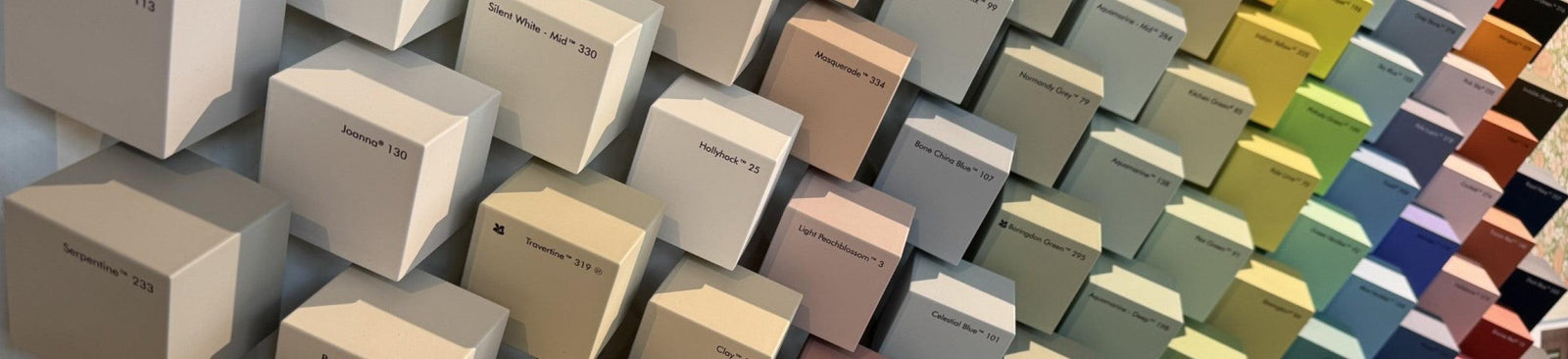
A Little Greene color card helps you make an initial selection and compare different color families side by side. Use the card primarily as orientation and not as a definitive color assessment.
The small color swatches don't fully show how a shade reacts to light and surroundings on a large wall.
Sample pots for a larger color area
With a sample pot you can assess the color on a larger area. Apply the paint to a loose test board or sturdy piece of cardboard and preferably use two coats.
Then move the area around the room. Look at it by the window, in a dark corner and next to the materials the color needs to be combined with.

Wallpaper samples for color and material
A wallpaper sample shows what the colors, lines and details look like in reality. You can also better assess the texture, background and appearance of the material.
Place the sample next to your paint samples, floor, curtains and upholstery fabrics. Look at the whole both during the day and in the evening under artificial light.

Selected Tip: Leave samples in the room for several days. A color that feels right at the first light moment can appear cooler, warmer or darker at another time.
How much paint do you need?
The required amount of paint depends on the surface, the paint quality, the substrate and the number of coats. A smooth, previously painted wall generally absorbs less paint than new or highly porous plasterwork.
First measure the height and width of all surfaces to be painted. Optionally subtract large windows and doors from the total. Then divide the total square meters by the indicated coverage per liter.
Also take into account:
- the recommended number of coats;
- a strong color difference between the old and new color;
- repairs or an uneven surface;
- extra paint for future damage;
- woodwork, baseboards and frames that are calculated separately.
- The stated coverage is a guideline. The actual amount may vary due to the surface and the application method.
How much wallpaper do you need?
With wallpaper, it's not just the number of square meters that matters. The roll width, roll length, pattern repeat and design match also determine how many rolls are needed. Especially with wallpaper with a large pattern, extra material may be needed to make the drops match nicely.
To make the calculation simple, you can use our wallpaper calculator on the product page. Enter the width x height of the wall and the calculator calculates how much wallpaper you need. This takes into account the pattern of the chosen wallpaper and a safety margin of 5 cm on all sides.
Therefore measure the wall carefully:
- measure the full width of the wall;
- measure the height at multiple points;
- for different heights always use the largest measurement;
- calculate multiple walls separately;
- check if there are sloped parts, alcoves or other irregularities.
With a standard calculation you usually don't need to directly subtract windows and doors from the wall surface. The material around these openings is often needed to let the pattern run through properly. Moreover, a small extra margin prevents you from running out of material during hanging.
Selected Tip: Rather order a small safety margin than exactly the calculated minimum. This prevents you from running out of paint during painting and keeps something left over for small repair work.
Use the wallpaper calculator
Open the desired wallpaper on our website and enter the width and height of the wall in the wallpaper calculator. The calculator processes the product specifications of the chosen design and shows the required amount of wallpaper.
Do you have multiple walls, a sloped ceiling or a room with many windows, doors and interruptions? Then calculate the wall sections separately or contact us for an additional check or calculation of the required amount.

Selected Tip: Order all required rolls at once. This ensures you have sufficient material for the pattern and reduces the chance of small color differences between different production batches.
What is the delivery time for Little Greene paint and wallpaper?
Delivery time differs per product and destination. Little Greene paint is mixed in the chosen color and paint quality, while the delivery time for wallpaper depends on current stock at the supplier. Therefore always check the current delivery time on the relevant product page.
Order Little Greene paint online
Little Greene paint ordered online is professionally mixed in the chosen color at Selected Wallpapers. Orders placed before 3:00 PM can be shipped the same working day if sufficient stock of the required base material is available.
Have paint mixed directly in Montfoort
Do you need an extra can of paint at short notice? In our Studio in Montfoort we can mix Little Greene paint on site in the desired color, provided the right base paint and chosen packaging format are in stock. The studio can be visited by appointment and has the Little Greene paint collection and professional mixing equipment.
Contact us in advance when you want to take the paint with you the same day. Then we can check if the right base, paint quality and quantity are available and prepare the can for you.

Delivery time for Little Greene wallpaper
For wallpaper, delivery time depends on current stock of the chosen design and colorway. Some rolls are immediately available. The current indication is stated on the product page.
Preferably order wallpaper well before the planned installation date. This allows sufficient time for delivery and wallpaper inspection before installation.
Take samples and project planning into account
Before the final order, plan sufficient time to assess paint and wallpaper samples in the space. For larger projects we recommend having availability checked in advance, so that all required paint and wallpaper can be delivered at the right time.
Selected Tip: Do you need Little Greene paint quickly? Contact our Studio in Montfoort. With sufficient stock we can mix the desired can directly for you. For online orders: ordered before 3:00 PM, shipped the same working day; delivery time varies by country and destination.
Where do you buy Little Greene Paint & Paper in the Netherlands?

Little Greene is offered through specialized retailers. At Selected Wallpapers you can order Little Greene paint, wallpaper, samples and related products and combine them within one interior plan.
Online you'll find information per product about color, design, paint quality, sheen level, roll size and pattern repeat, among others. If you need help with your choice, you can ask for advice about combining paint, wallpaper and materials.
A specialized retailer is especially valuable when you're unsure between different paint qualities, colors or wallpaper designs. The right choice doesn't just depend on taste, but also on surface, use, light conditions and scale.
Little Greene is generally not available as regular stock at general DIY stores. The paint and wallpaper are mainly offered through specialized dealers and interior shops.
Selected Tip: Before a consultation, collect photos of the space, dimensions, information about light conditions and samples of existing materials. This allows for much more targeted thinking and advice.
Shop the look