

Yellow wallpaper
- 0158
- 0321
- 0164
- 1132
- 0307
- 35+
- Marshmallow
- Primary Colour
- Dusry Olive
- Withered Rose
- Olive Drab
- 15+
- Snow White
- Hazelnut
- Mint
- Royal Blue
- Smaragd Green
- 19+
- Lapis
- Soft Fennel
- Fennel
- Lichen
- Pewter Gold
- 0113
- 0221
- 0217
- 0639
- 0873
- 6+
- Ocre
- Celadon
- Rosado
- Piedra
- Pizarra
- 1+
- Sakura & Astrantia
- Euphorbia & Alabaster
- Sap & Alabaster
- Laurustine & Galaxias
- Opal
- 10+
Yellow wallpaper is easier to live with than most people expect, provided you judge it in the room it is meant for. A swatch under showroom lighting tells you little; the same paper taped to your own wall for two days tells you plenty. Our 374 designs in yellow tones come from European houses such as Casamance, Elitis, Dedar, GP&J Baker and Morris & Co, and we ship samples to US addresses.
How yellow wallpaper reacts to the light in your room
Orientation does more to a yellow than the name in the sample book. North-facing rooms get flat, cool light that drags pale yellows toward green, which is why a soft butter tone can turn faintly sour on a north wall. South- and west-facing rooms push the other way, and an ochre can read close to orange by late afternoon. So choose against the light: cool rooms carry honey and mustard well, while a room that already runs warm takes a sharper yellow without tipping over. In a windowless powder room you are working with lamplight anyway, and yellow makes that light look deliberate rather than thin.
Ochre, honey or chartreuse: choosing your yellow
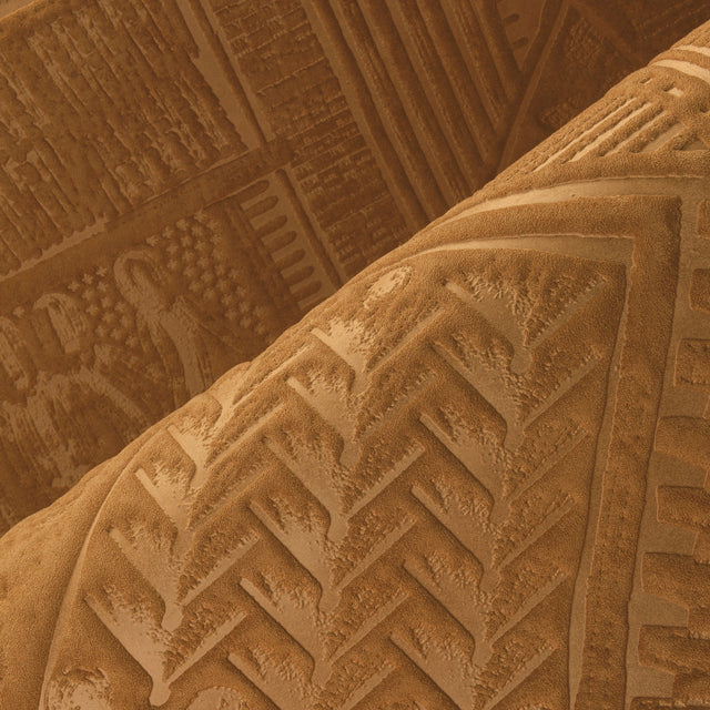
Ochre and mustard sit close to raw earth pigment and behave almost like a neutral once they are up, at ease next to walnut, rattan and unpainted oak. Honey and straw are quieter, useful in a primary bedroom where you want warmth without a declaration. Chartreuse and acid yellow ask more of a room and give more back; one papered wall in a breakfast nook can carry the whole space. Deeper golds shade into metallic territory, where our gold wallpaper and orange-yellow range take over.
Why texture changes how loud a yellow reads
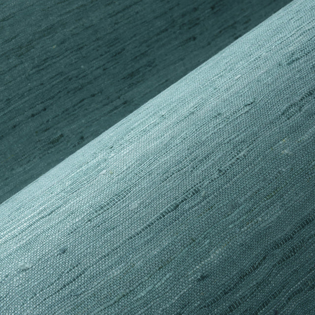
Printed on smooth paper, a yellow plays at full volume. In a woven surface it does not: light breaks across the weave and the wall reads closer to warm fabric than to a flat block of color. If you love the shade but not the intensity, compare a paperweave wallpaper or a linen wallpaper in the same family.
Trim, wood and colors that sit well beside yellow wallpaper
Trim is the decision people underestimate. Bright white woodwork against ochre makes the yellow look brassy, while a warm off-white or a soft gray-green lets it settle. Deep green and inky blue are the dependable partners, so our green wallpaper pages are worth opening if you are papering adjoining rooms. In an older house the historic yellows of Morris & Co wallpaper hold their own against dark stained woodwork, while House of Hackney wallpaper takes the same color somewhere louder.
Ordering European wallpaper for a US home
Everything ships from the Netherlands, and duties and taxes are included in the price shown, so nothing extra turns up at the door. Roll width and length differ from house to house and are printed in centimeters and meters, so check both on the product page and switch our wallpaper calculator to feet and inches before you order. And on drywall, a strong yellow catches each ridge and seam, so time spent skimming the wall or hanging lining paper pays off.
-
International shipping
Payment in own currency
-
No hidden costs
Duties & Taxes included in checkout
-
Sample Service
Up to $35 cashback on your samples
-
Personal advice
Help with selection and ordering.
Frequently Asked Questions
Which yellow wallpaper suits a small room?
Can yellow wallpaper work in a bedroom?
What is the difference between pastel yellow and ochre wallpaper?
Which colour combinations work well with yellow wallpaper?
Do you sell samples of yellow wallpaper?
Discover other colours
Each colour sets a different tone.