Inspiration
Wallpaper trends autumn 2026: this is what we see in the new collections
The first autumn collections for 2026 are starting to arrive — and with them, the new directions for interiors are becoming increasingly clear. New colours are being announced, we're seeing the first designs, and during visits to the makers, we're discovering up close which materials, structures and techniques will play a bigger role. Although many brands won't present their complete autumn collections until September, the first shifts are already emerging. We're seeing warmer and richer colours, lots of attention for tactility and surfaces, and designs that give an interior character without necessarily being bold. In this trend blog, we share what we notice in the collections and previews for autumn 2026. Not as a definitive list of trends that every interior must follow, but as a first look at the colours, designs and materials we expect to see on the wall more often in the coming months.
1. Tactile Walls sets the tone for autumn 2026
We recently described in detail how Tactile Walls is an important interior trend for 2026. Now that we're examining the first autumn collections, it's becoming clear how strongly this attention to material and tactility appears in the new designs.
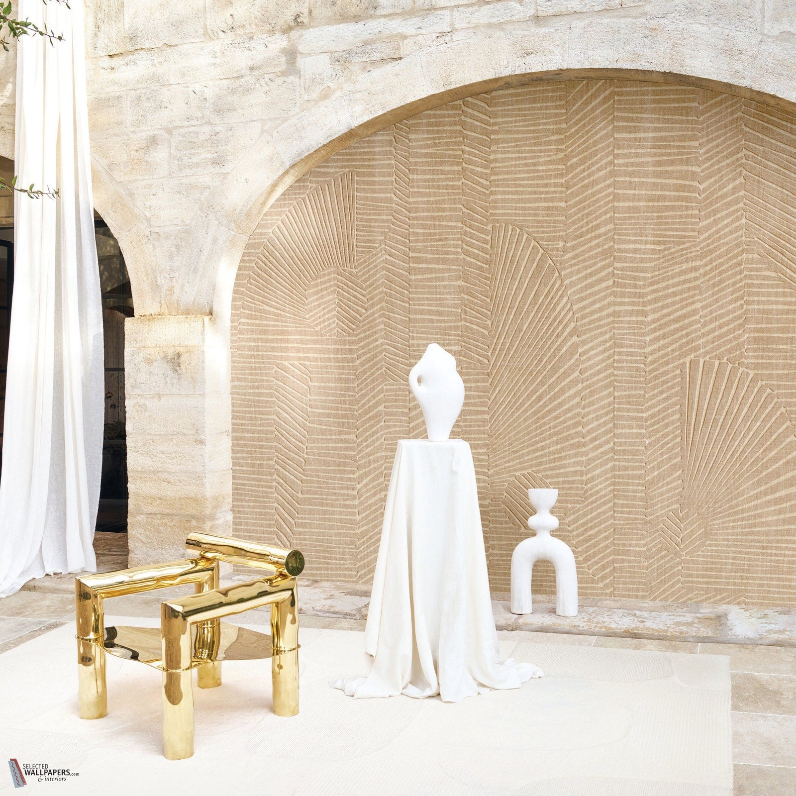
During our factory visit to Masureel, we got a preview of the new collections. What immediately stood out were surfaces reminiscent of natural stone, marble, travertine, plasterwork, woven textiles, patina, wood and oxidised metal. Not as literal reproduction, but as inspiration for a new wall texture.
At Casamance, we see a similar movement. Striato – Textures draws inspiration from artisanal plasterwork, patinated surfaces and mineral effects. Relief, matte colours, imperfection and the interaction between light and surface also play an important role.
What makes Tactile Walls interesting for autumn 2026 isn't simply more texture. The wall is increasingly being treated as a material within the interior, alongside wood, natural stone and textiles.

Selected trend signal: Luxury shifts from what you see to what you can almost feel.
Want to know exactly what Tactile Walls means and how to apply tactile wall coverings? Read our comprehensive blog about Tactile Walls.
2. Craftsmanship is luxury: artisanship becomes visible
With the attention to material comes a stronger emphasis on craftsmanship. It's not just the end result that counts; the way a surface appears to be woven, plastered, braided or hand-worked also becomes part of the design.
We see this clearly at Casamance. Benang refers to traditional weaving techniques and passing down expertise, while Les Tisserands reaches back to centuries-old Flemish weaving craftsmanship, bringing together natural fibres and different textures.
During our visit to Masureel, we also saw lots of attention to subtle imperfection. Relief, fibres, patina and irregularities aren't smoothed away, but instead give the surface character.
This fits with a broader change in how we experience luxury. A high-quality wall doesn't need to be perfectly smooth or uniform. A visible fibre, an irregular line or a surface that seems almost hand-formed can actually enrich an interior.
Selected trend signal: The new luxury isn't just about what a material costs, but also about the craftsmanship you can see in it.
3. Deep Earth Colours: earth tones gain more depth
The natural colours we've seen a lot in interiors in recent years aren't disappearing. But for autumn 2026, the palette seems to be becoming richer and deeper.
Alongside chalk white, cream, greige and taupe, we're seeing a remarkable amount of caramel, cognac, copper, rust, chocolate and burgundy. Colours like sage, moss, olive, petrol, teal and greyed blue-green are also coming to the fore.
We particularly noticed the combination of warm brown and rust tones with olive, petrol and dark blue-green.

What these colours have in common is that they're rarely bright or saturated. They appear greyed, mineral and sometimes almost patinated. This keeps them connected to the natural colour world, but they give an interior more character than just beige and sand.
So warm living doesn't automatically mean neutral living.
Selected trend signal: Neutrals remain important, but are being supplemented with deeper colours like cognac, chocolate, rust, moss, olive and petrol.

From trend colour to interior palette
In our view, the most interesting way to apply this development isn't by simply declaring one colour the trend colour. > Look at combinations.
A deep olive green can beautifully complement chalk white, linen and dark wood. Petrol takes on a softer character alongside cream and natural stone, while cognac and rust add warmth to an interior with lots of light materials.
Wallpaper can be the starting point. Choose two or three shades from a design and let them return in paint, fabrics or other materials. This creates a colour palette that's rich, yet feels like one whole.
4. Nature, refined: nature becomes less literal
Nature remains an important source of inspiration, but we're seeing a change in how designers translate that nature to the wall.
Not every nature-inspired wallpaper needs to show leaves, flowers or trees.
We see natural stone, marble, sediment, wood-like forms and weathered surfaces returning as inspiration for abstract structures and compositions. Organic lines and curved geometry therefore feel more architectural than decorative.
We recognise the same principle in new collections: natural materials, craftsmanship and landscape are constantly reinterpreted. So it's not about yet another botanical trend, but about nature as a source for colour, form and material.
A rock formation can become a layered pattern. A wood grain an organic interplay of lines. Waves can transform into rhythm and relief. And a weathered surface can form the inspiration for an almost plain wall covering.
Selected trend signal: Nature isn't disappearing from the wall, but is becoming less literal.
For those who want to bring natural influences into their interior, this actually broadens the choice. A bold botanical design can still be beautiful, but nature can also return more subtly in a mineral texture, organic line play or colours inspired by stone, earth and landscape.
5. The New Stripe: the stripe becomes softer
A development that surprisingly clearly emerges amongst all the materials and textures is the stripe.
Casamance brings Rayures, a collection where the stripe is linked to the lines of shutters, parasols and architecture on the French Riviera. At the same time, we see a striking amount of vertical lines, ribs and linear textures.
The new stripe doesn't need to be the crisp, contrasting band we traditionally associate with striped wallpaper.
We see lines actually becoming more tactile, more irregular and softer. Sometimes the stripe is created through colour difference, sometimes through relief or a woven structure. This blurs the boundary between pattern and material.
This makes the stripe interesting for both classic and modern interiors. A clear wide stripe gives the wall a distinct rhythm, while a fine linear structure can appear almost like a plain wall from a distance.
Selected trend signal: The new stripe isn't just about contrast. Line, rhythm and material increasingly go together.
What does a stripe do to the space?
A vertical stripe emphasises height and can give a room more rhythm. But how present that effect is depends strongly on the contrast, width and regularity of the lines.
Those who want to keep it calm can therefore look for a tone-on-tone stripe or a design where the lines are part of the texture. If you want more character, the difference between the bands may be more clearly visible.
This makes striped wallpaper much more versatile than the classic two-colour stripe.
6. Metallic becomes material instead of glamour
Metallic also isn't disappearing from the new collections. Its character is changing though.
Gold, bronze and copper effects rarely have a pronounced shine. The metallic effect was more reminiscent of oxidation, patina or a mineral surface that catches the light at certain moments.
In various collections, reflection, lustre and material effect play an important role; metallic inks are used, for example, to reinforce texture and relief. This makes metallic more subtly applicable.
A wall doesn't need to be visibly gold or silver. Sometimes you only discover the lustre when you walk past the wallpaper or when light falls on the wall from a different angle.
Selected trend signal: Metallic doesn't need to shine to radiate luxury. For autumn 2026, we mainly see soft reflection, patina and mineral lustre.
This is also exactly where Tactile Walls and the new autumn collections meet: a wall's appearance is determined not only by colour and design, but also by relief, material and the light in the room.
What do the new collections tell us about autumn 2026?
When we place these first collections side by side, we see above all that colour, design and material are increasingly designed together.
A stripe can emerge from relief. Metallic becomes part of a surface. Nature is translated into abstraction and texture. An almost plain wall covering can have just as much character as a bold design through its material effect.
This also changes the way you can look at wallpaper.
Not just:
Which design do I like?
But also:
What do I want this wall to add to my interior?
Are you looking for warmth? More depth? An architectural rhythm? A surface reminiscent of stone or textile? Do you want to add colour or rather a calm wall that only reveals its details up close?
It's precisely these questions that help you choose something from all the new trends that will still suit your interior in a few years.
Selected insight: The wall isn't just being decorated. It's increasingly being designed as part of the interior.
How do you apply the wallpaper trends of autumn 2026?
In our view, a trend never needs to be the starting point of an interior. See the new collections mainly as inspiration to look at colour, material and design differently.
Want more warmth? Look beyond beige and discover the deeper earthy colours, like olive, cognac, rust or petrol.
Do you like calm walls? Look for a tactile or mineral wall covering that appears understated from a distance, but shows texture up close.
Want more rhythm in a room? A refined stripe or linear texture can add architecture without immediately becoming dominant.
May the interior feel a bit richer? Then look at wallpaper where relief, fibres or a subtle metallic effect responds to the light.
And perhaps most importantly: don't combine as many trends as possible. See which trend adds something to your interior and works well with the colours and materials already there.
To be continued
Our trend picture isn't complete yet — and that's exactly what makes this period interesting.
At Masureel, we've already been able to view the new designs during a factory visit, and Casamance is announcing more and more new and upcoming collections. For instance, Benang, Les Tisserands and Exploration are already listed as new, and Rayures and Striato – Textures are being presented around this period as new or upcoming collections. Masureel is now showing Caldera, Erosion, Ray, Traces and Serica as new collections.
There's also news coming in the colour department. Little Greene is launching no fewer than 26 new colours on 14 September 2026, divided across the renewed Colours of England and Colour Scales colour cards. The new shades confirm a number of developments we also see in the autumn collections: balanced neutrals, warmer and softer green and blue tones, and fresh, light colours with character.

But September hasn't started yet.
That's when more brands will present their new collections and we can see which of these signals develop further and which new directions emerge.
That's why we deliberately don't see this blog as a closed list of the trends of 2026, but as our first analysis of what we actually see in the new autumn collections.
And as soon as the next collections arrive, we'll look again.
To be continued.
Shop the look