BESTSELLERS
 NEW ARRIVALS
 SALE
SALE


 Colors


 Materials


 ALL BRANDS


 Themes


 BESTSELLERS
 NEW ARRIVALS


 BESTSELLERS
 NEW ARRIVALS
 DIRECTLY AVAILABLE
 SALE
SALE


 BESTSELLERS
 NEW ARRIVALS


 Little Greene verf
 Colours of England verfcollectie
 Colour Scales verfcollectie
 Sweet Treats verfcollectie
 RAL kleuren verf


Orange wallpaper
- Retour en Grace
- Esprit de Charme
- Une Vie D'Artiste
- Le Genie
- Toscane
- 12+
- 1022
- 1287
- 1148
- 1044
- 1018
- 17+
- Brick/Manilla
- Wedgwood
- Artichoke
- Cowslip
- Linen
- 8+
- Orient
- Aubergine
- Acqua
- Rose
- Cipria
- 32+
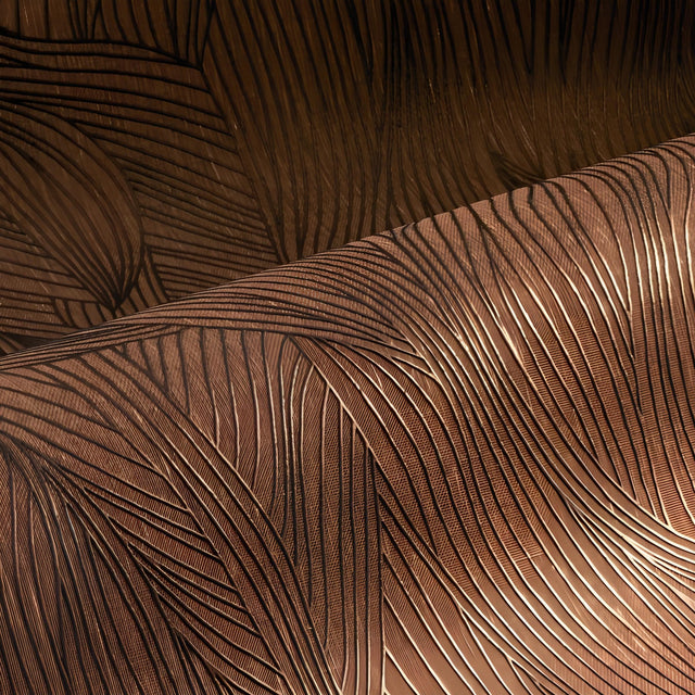
Orange wallpaper holds daylight in the wall and keeps handing it back after the sun has moved off that side of the house. That is why it lands most often in rooms used at the edges of the day: an east-facing breakfast nook, a den that wakes up after six. Our range runs from smoked terracotta through rust and copper to a clear saffron.
How much orange wallpaper a room can carry
The instinct is to keep it to one accent wall. Often the opposite works better. A powder room papered floor to ceiling in deep rust reads as a deliberate little room rather than an accident, because you pass through small spaces instead of sitting in them. In a living room or primary bedroom, a low-saturation terracotta on all four walls behaves more like a warm neutral.
How orange reads in north-facing and south-facing rooms
North light is cool and steady, and it pulls orange toward brown: a shade that looked apricot on the sample settles into something nearer clay. South and west rooms push the same paper toward red by evening. Tape a sample to the wall you mean to paper and judge it at night as well as at noon. For a north room, go one step warmer than feels comfortable in your hand.
Where orange wallpaper borders brown, red and green
Color families run into each other at the edges, and this one has three borders worth knowing before you order. At the smoky, burnt end the distance to our brown wallpaper is a matter of a few degrees, and a terracotta that looked clearly orange on a sample can read as brown once it covers a wall. Take the yellow out of a rust and you are into red wallpaper territory, which is why a rust and a brick can hang in one room without arguing. The border worth holding onto is the one with green wallpaper: one olive note somewhere in the room, a chair or a painted door, keeps a warm scheme from turning syrupy. When two shades are close, order both and hold them against the trim you already live with. White trim makes saffron louder and terracotta dustier than the sample suggested.
Woven and matte textures in orange wallpaper
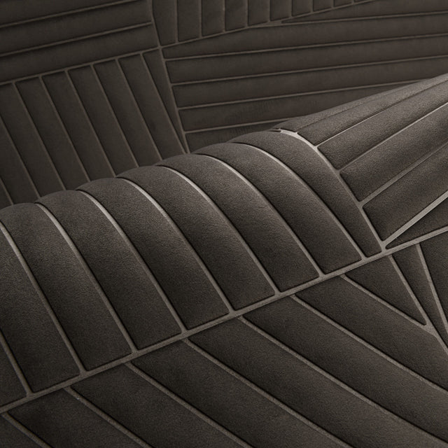
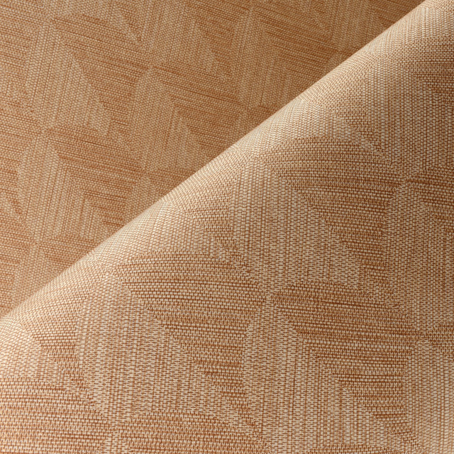
Flat color across a large wall can go dead under a single overhead light. A woven ground breaks the light up and gives the tone somewhere to move, which is the argument for a paperweave wallpaper in a warm shade over a smooth print. Casamance tends to work the color into panoramic scenes and layered, painterly grounds, while Elitis puts it on textured, matte surfaces where the pigment sits unevenly on purpose. For something sharper, the seventies-minded designs in our retro wallpaper use orange as a block color.
Ordering orange from the Netherlands
European rolls are narrower than most American installers expect: where a design comes by the roll, the standard is 20.9 in (53 cm) wide and 33 ft (10.05 m) long, so measure your wall in inches and let us check the drop count with you. Check the backing as well. Much of this range is non-woven wallpaper, hung by pasting the wall rather than the paper, and it comes away in whole panels when you redecorate. That matters on drywall. Duties and taxes are included in the price shown, shipped from the Netherlands.
-
International shipping
Payment in own currency
-
No hidden costs
Duties & Taxes included in checkout
-
Sample Service
Costs refunded up to max $35
-
Personal advice
Help with selection and ordering.
Frequently Asked Questions
Which type of orange wallpaper suits a small room?
What does orange wallpaper combine well with?
Is orange wallpaper suitable for a bedroom?
What is the difference between orange and terracotta wallpaper?
How do I order a sample of orange wallpaper?
Discover other colours
Each colour sets a different tone.