BESTSELLERS
 NEW ARRIVALS
 SALE
SALE


 Kleuren


 Materialen


 Merken


 Thema's


 BESTSELLERS
 NEW ARRIVALS


 BESTSELLERS
 NEW ARRIVALS
 DIRECTLY AVAILABLE
 SALE
SALE


 BESTSELLERS
 NEW ARRIVALS


 Little Greene verf
 Colours of England verfcollectie
 Colour Scales verfcollectie
 Sweet Treats verfcollectie
 RAL kleuren verf


Natural wallpaper
- String No8
- Point 2003
- Clunch
- Charleston Gray
- Mouse's Back
- 14+
- Retour en Grace
- Esprit de Charme
- Une Vie D'Artiste
- Le Genie
- Toscane
- 12+
- White
- Ebano
- Bronzo
- Orange Brulee
- Vieil Or
- 22+
- 1022
- 1287
- 1148
- 1044
- 1018
- 17+
- Brown
- Oatmeal
- Shell
- Beige
- Warm White
- 4+
- Creme
- Taupe/Green
- Gold
- Green
- Taupe
- 2+
- Dessert
- Limestone
- Misty Grey
- Seagrass Green
- Pool Blue
- 3+
- Brown
- Oatmeal
- Shell
- Beige
- Warm White
- 4+
Natural wallpaper covers the tones a room falls back on when nothing else is asking for attention: sand, oatmeal, ivory, clay, warm gray. What makes those colors hard to get right is what makes them worth it. A neutral shows every seam and every shift in daylight, so the material itself has to carry the wall.
How natural wallpaper behaves in American daylight
Light is the variable most people underestimate. A south-facing den pulls the yellow forward in an oatmeal ground; the same roll in a north-facing living room reads cooler, almost stone. Rooms without a window, like an interior powder room or a stair landing, read a shade darker than the sample you held up at the glass. Tape your samples to the wall and look at them at 8 a.m. and again at 6 p.m. With neutral tones that habit prevents more returns than any advice we can give.
Rooms where neutral tones do the most work
An entryway makes the strongest case: everyone walks through it, nobody furnishes it, so texture carries the space on its own. A breakfast nook keeps its morning light instead of arguing with a pattern. Above a headboard, a beige wallpaper gives artwork and bedding somewhere quiet to sit. Powder rooms are the happy exception: small enough that a coarse weave reads as a decision rather than a backdrop.
Woven fibers versus printed wallpaper grounds
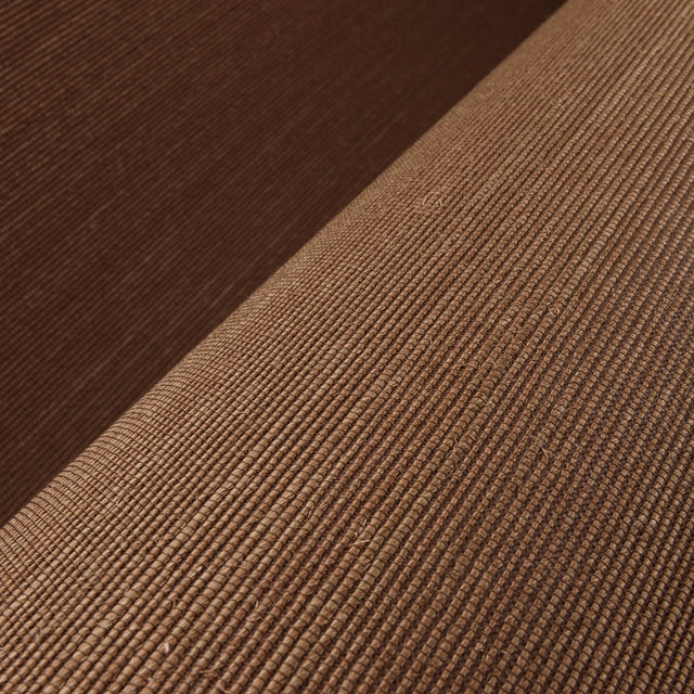
Two very different products sit side by side here. Grasscloth shifts tone from panel to panel, which is the point of it rather than a flaw. Raffia throws a soft sheen across the room as the sun moves. Paperweave has a tighter grain, for texture without the drama, and cork warms a wall and takes the hard edge off an echo.
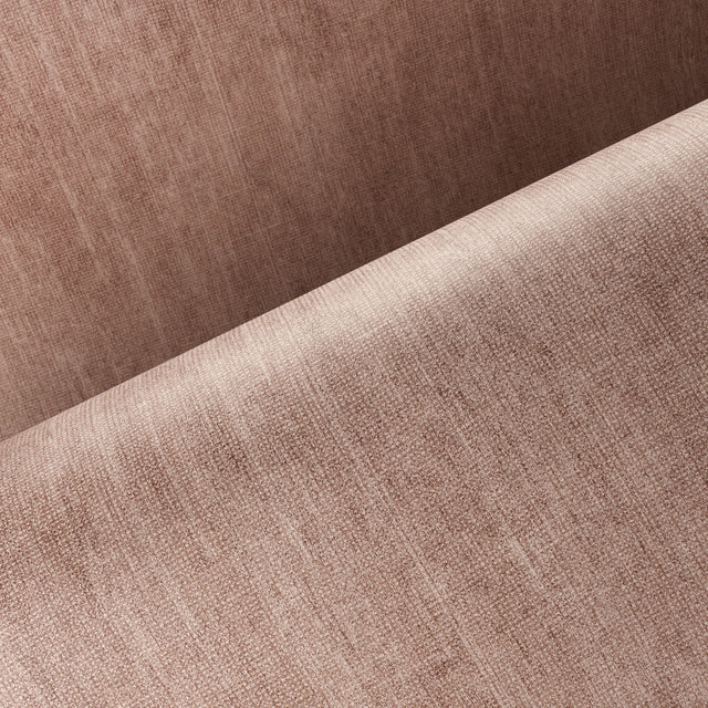
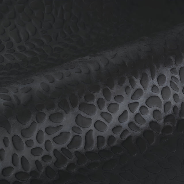
Printed and embossed grounds give the same soft color on a flatter surface: more forgiving around outlets and switch plates, and steadier over drywall that has been patched.
European wallpaper houses behind the quiet colors
Casamance keeps its French restraint even in the plainest grounds, with pigments that stay warm under lamplight. Cole & Son brings the English side of it, where a neutral usually carries a faint pattern you only notice up close. Texdecor sits at the textured end of our neutral selection, where the surface does more of the talking than the print.
Ordering natural wallpaper from Europe
European rolls are cut to different sizes than American ones. The common format runs 33 ft (10.05 m) long and 20.9 in (53 cm) wide, though wide-width goods and panel sets vary by house, so check the size on the product page before you order. Duties and taxes are included in the price shown, and your order ships from the Netherlands. Unsure about pattern repeat or how much prep your walls need? Write to us first.
-
International shipping
Payment in own currency
-
No hidden costs
Duties & Taxes included in checkout
-
Sample Service
Costs refunded up to max $35
-
Personal advice
Help with selection and ordering.
Frequently Asked Questions
What is natural wallpaper?
Which rooms suit natural wallpaper?
How do I combine natural wallpaper with furniture?
Is natural wallpaper sustainable?
Can I order a sample first?
Discover other colours
Each colour sets a different tone.